Placeholder
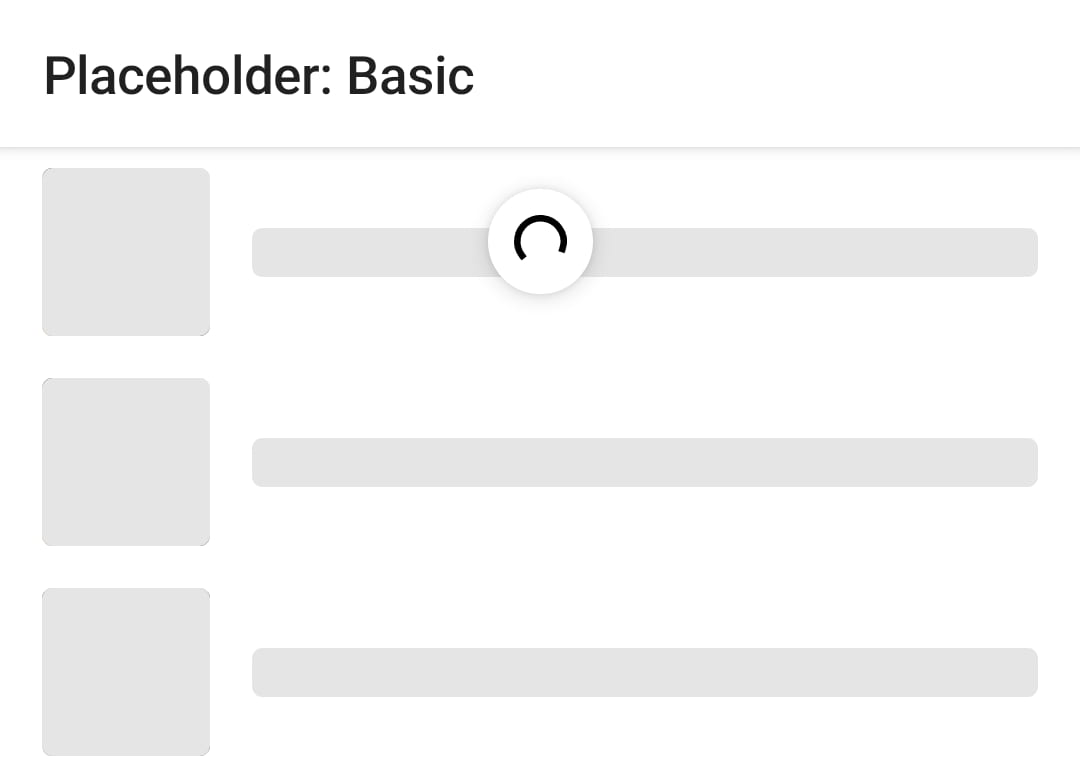
A library which provides a modifier for display 'placeholder' UI while content is loading.
More information on the UX provided by this library can be found on the Material Theming Placeholder UI guidelines.
There are actually two versions of the library available:
- Placeholder Foundation: Provides the base functionality and depends on Jetpack Compose Foundation. This version requires the app to provide all of the colors to display.
- Placeholder Material. This uses the foundation library above, but also provides sensible default colors using your app's Material color palette.
Tip
You only need to use one of the libraries, and most apps should use Placeholder Material. The APIs of the libraries are (mostly) equivalent with only the imports being different. Where possible we have provided equivalent code samples below.
Basic usage
At the most basic usage, the modifier will draw a shape over your composable content, filled with the provided color.

import io.github.fornewid.placeholder.material.placeholder

Text(
    text = "Content to display after content has loaded",
    modifier = Modifier
        .padding(16.dp)
        .placeholder(visible = true)
)
import io.github.fornewid.placeholder.material3.placeholder

Text(
    text = "Content to display after content has loaded",
    modifier = Modifier
        .padding(16.dp)
        .placeholder(visible = true)
)
import io.github.fornewid.placeholder.placeholder

Text(
    text = "Content to display after content has loaded",
    modifier = Modifier
        .padding(16.dp)
        .placeholder(
            visible = true,
            color = Color.Gray,
            // optional, defaults to RectangleShape
            shape = RoundedCornerShape(4.dp),
        )
)
Placeholder highlights
The library also provides some 'highlight' animations to entertain the user while they are waiting. There are two provided by the library, but you can also provide your own.
Fade
This highlight fades a color over the entire placeholder in and out.
import io.github.fornewid.placeholder.PlaceholderHighlight
import io.github.fornewid.placeholder.material.placeholder
import io.github.fornewid.placeholder.material.fade

Text(
    text = "Content to display after content has loaded",
    modifier = Modifier
        .padding(16.dp)
        .placeholder(
            visible = true,
            highlight = PlaceholderHighlight.fade(),
        )
)
import io.github.fornewid.placeholder.PlaceholderHighlight
import io.github.fornewid.placeholder.material3.placeholder
import io.github.fornewid.placeholder.material3.fade

Text(
    text = "Content to display after content has loaded",
    modifier = Modifier
        .padding(16.dp)
        .placeholder(
            visible = true,
            highlight = PlaceholderHighlight.fade(),
        )
)
import io.github.fornewid.placeholder.PlaceholderHighlight
import io.github.fornewid.placeholder.placeholder
import io.github.fornewid.placeholder.fade

Text(
    text = "Content to display after content has loaded",
    modifier = Modifier
        .padding(16.dp)
        .placeholder(
            visible = true,
            color = Color.Gray,
            // optional, defaults to RectangleShape
            shape = RoundedCornerShape(4.dp),
            highlight = PlaceholderHighlight.fade(
                highlightColor = Color.White,
            ),
        )
)
Shimmer
This displays a gradient shimmer effect which emanates from the top-start corner.
import io.github.fornewid.placeholder.PlaceholderHighlight
import io.github.fornewid.placeholder.material.placeholder
import io.github.fornewid.placeholder.material.shimmer

Text(
    text = "Content to display after content has loaded",
    modifier = Modifier
        .padding(16.dp)
        .placeholder(
            visible = true,
            highlight = PlaceholderHighlight.shimmer(),
        )
)
import io.github.fornewid.placeholder.PlaceholderHighlight
import io.github.fornewid.placeholder.material3.placeholder
import io.github.fornewid.placeholder.material3.shimmer

Text(
    text = "Content to display after content has loaded",
    modifier = Modifier
        .padding(16.dp)
        .placeholder(
            visible = true,
            highlight = PlaceholderHighlight.shimmer(),
        )
)
import io.github.fornewid.placeholder.PlaceholderHighlight
import io.github.fornewid.placeholder.placeholder
import io.github.fornewid.placeholder.shimmer

Text(
    text = "Content to display after content has loaded",
    modifier = Modifier
        .padding(16.dp)
        .placeholder(
            visible = true,
            color = Color.Gray,
            // optional, defaults to RectangleShape
            shape = RoundedCornerShape(4.dp),
            highlight = PlaceholderHighlight.shimmer(
                highlightColor = Color.White,
            ),
        )
)
Usage
repositories {
    mavenCentral()
}

dependencies {
    // If you're using Material, use placeholder-material
    implementation "io.github.fornewid:placeholder-material:<version>"

    // If you're using Material3, use placeholder-material3
    implementation "io.github.fornewid:placeholder-material3:<version>"

    // Otherwise use the foundation version
    implementation "io.github.fornewid:placeholder-foundation:<version>"
}
Library Snapshots
Snapshots of the current development version of this library are available, which track the latest commit. See here for more information on how to use them.
Contributions
Please contribute! We will gladly review any pull requests. Make sure to read the Contributing page first though.
License
Licensed under the Apache 2.0 license. See LICENSE for details.
